Components that
make you stand out.
React components, animations, and effects. Preview them, make them yours, and bring them into your next project.

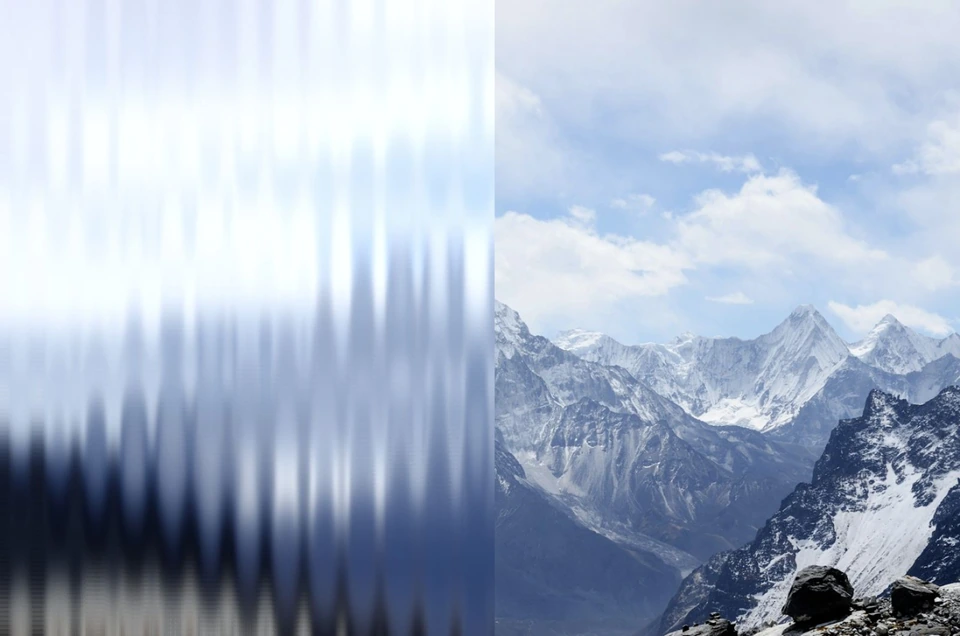
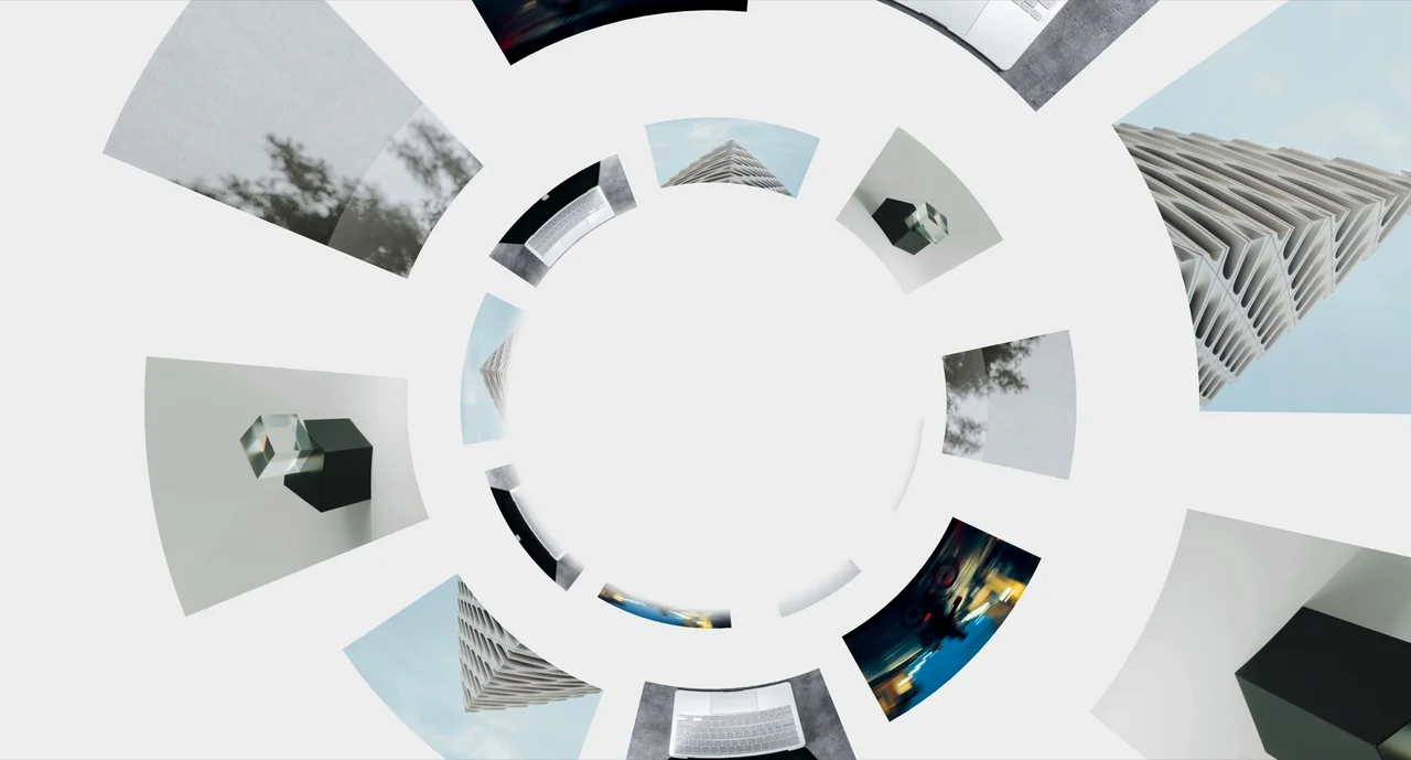
An emerging image cloud with circular rotation, pronounced perspective growth, a shared entrance pulse and fading scroll impulses.
| Property | Type | Default | Description |
|---|---|---|---|
images | readonly string[] | Required | Image sources repeated through the depth field. Empty lists leave a text-only hero. |
speed | number | 5 | Continuous forward travel speed through the cloud, in depth units per second. |
entryBurst | number | 70 | Peak forward speed of the entrance pulse. Rotation shares the same speed multiplier; both ease back to their normal speeds. Changing it replays the catalog preview. |
entryDuration | number | 2.8 | Duration of the entrance pulse from an empty image field. The first quarter accelerates; the remaining three quarters ease back into drift. |
entryDelay | number | 0 | Wait before the entrance starts. The heading and buttons are already visible while the image field stays empty. Only time on screen counts, and it has no effect when Entry duration is 0. Changing it replays the catalog preview. |
scrollBoost | number | 50 | Strength of a brief forward impulse while scrolling in either direction. Acceleration ramps up smoothly and fades after scrolling stops. |
rotationSpeed | number | 11 | Circular angular speed in degrees per second. A uniform screen scale keeps the orbit circular at every viewport shape. The entrance shares the forward speed multiplier. |
rotationDirection | select | counterclockwise | Choose counterclockwise or clockwise rotation. |
spread | number | 12 | Distance from the center of the image field. Larger values leave more space around the text. |
depth | number | 96 | Distance across which images approach and fade in. Source images are assigned independently of spatial and arrival order, so repeated images do not progress as a spiral. |
count | number | 36 | Number of image planes. The supplied images repeat through the field. |
imageSize | number | 3.8 | Base size of each image’s longest edge. Approaching images grow more strongly while moving outward from the vanishing point and beyond the viewport. |
imageRadius | number | 0 | Corner radius on the fixed base image box; scales with the image. Zero keeps sharp corners. |
textAlign | string | center | Customize the hero text and appearance. |
title | string | Follow your
curiosity. | Customize the hero text and appearance. |
subtitle | string | Empty | Customize the hero text and appearance. |
buttonText | string | Explore components | Call-to-action label. Empty hides the button. |
buttonHref | string | /components | Destination URL or section anchor. |
secondaryButtonText | string | Learn more | Call-to-action label. Empty hides the button. |
secondaryButtonHref | string | #controls | Destination URL or section anchor. |
fontFamily | string | 'Plus Jakarta Sans', 'Inter Variable', sans-serif | Heading font stack. Load Plus Jakarta Sans in the host project to match the demo. |
background | string | #ffffff | Customize the hero text and appearance. |
color | string | #242120 | Customize the hero text and appearance. |
fontSize | string | clamp(2rem, 5.5cqw, 5rem) | Customize the hero text and appearance. |
imageOrigin | DepthFieldOrigin | center | Nine vanishing points: center, edge midpoints and corners. Changing it preserves the current animation. |
showText | boolean | true | Show or hide the title, optional subtitle and buttons without stopping the image field. |
paused | boolean | false | Freeze the field. Reduced-motion preferences automatically show a static composition. |
height | number | string | 600 | Section height in pixels or a CSS length, such as 100svh. |
ref | DepthFieldHandle | — | replay() restarts the image entrance while the heading and buttons stay visible. |
className / style | string / CSSProperties | — | Additional root styling. |