Components that
make you stand out.
React components, animations, and effects. Preview them, make them yours, and bring them into your next project.
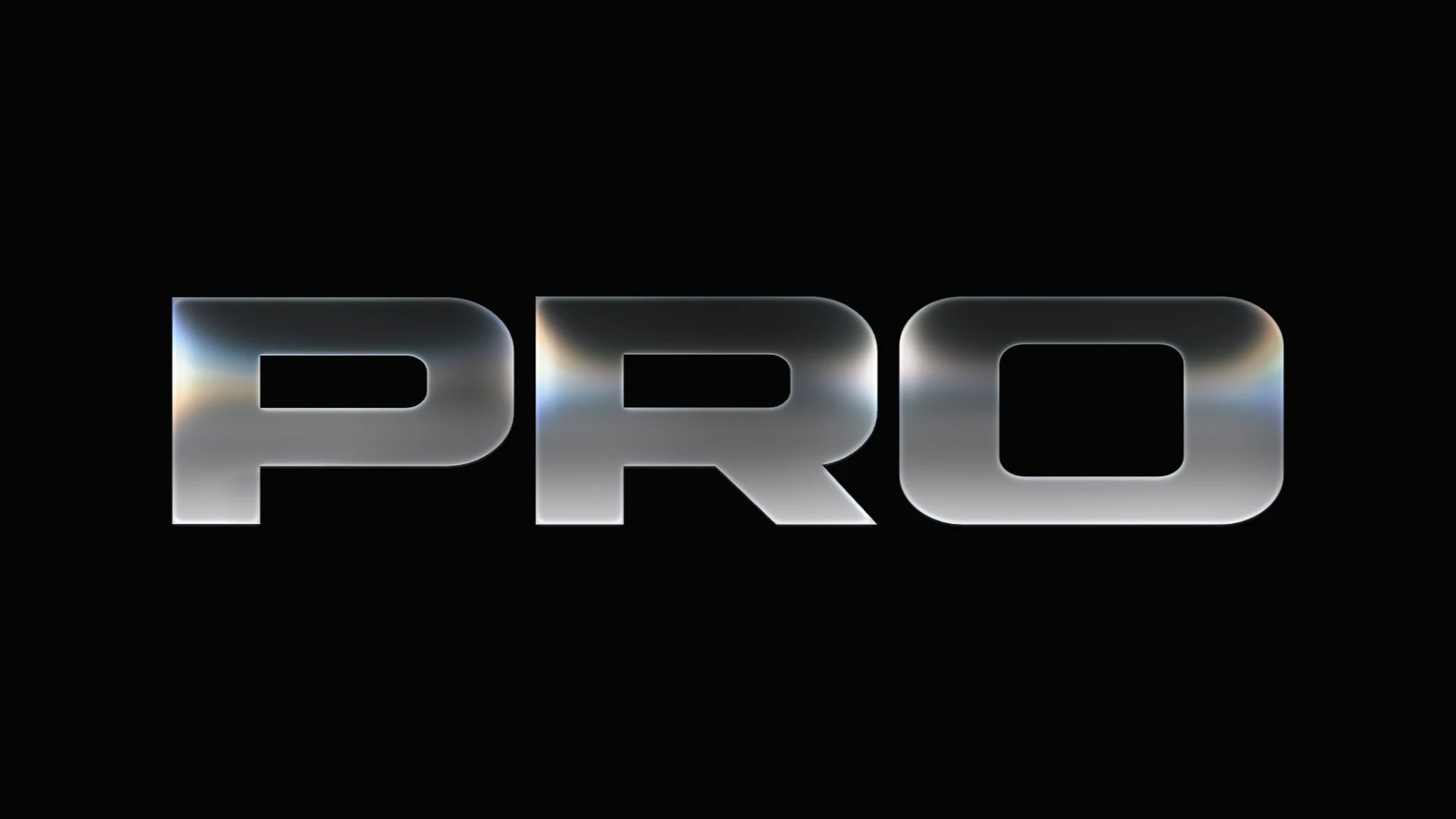
Glass letters with an optional character lift, adjustable opening flow, customizable top and bottom colors, original font contours and a refracted beam.
| Property | Type | Default | Description |
|---|---|---|---|
text | text | PRO | A short word works best for large display lettering. |
theme | select | dark | Dark by default, independently of the page. Choose Light for a white surface, or Auto to follow the inherited color scheme. |
topColor | string | auto | CSS color for the upper glass. Auto preserves the original theme palette. The beam and edge highlights keep their lighting. |
bottomColor | string | auto | CSS color for the lower glass. Auto preserves the original theme palette. Colors blend through the middle of each letter. |
reveal | boolean | true | On by default: lift each letter into place. Turn off to keep the text static while the original light flow plays. |
liftDuration | number | 1.75 | Total time from the first letter starting to rise until the last letter settles. Includes the character stagger. |
stagger | number | 0.55 | Total delay from the first letter to the last. The lift has no opacity fade. |
ease | "power4.out" | "power3.out" | "power2.out" | "power1.out" | "expo.out" | "sine.out" | "sine.inOut" | "none" | power4.out | Curve for the upward lift of each character; the shader's light flow keeps its original timing. |
beamFollowsLift | boolean | false | Off keeps the light beam fixed in the preview while letters rise. On moves the beam with each glyph, as in the previous lift. |
animateBeam | boolean | true | Turn off the automatic beam flow and show its settled appearance immediately. Character lift and cursor interaction remain active. |
openingDuration | number | 6.9 | One power4.out flow curve spans the whole word; it does not restart for each letter. Static flow (original) retains its continuous cycle. |
duration | number | 13.2 | Time for the light cycle. With character lift it stops after the entrance; static flow keeps cycling. |
intensity | number | 1.2 | Brightness of the white ray and its spectral color. Use Color separation to widen the existing spectral colors. |
dispersion | number | 1 | Area covered by the original spectral colors, including amber and orange. One preserves the original refraction. Higher values widen those colors without boosting saturation or widening the white beam. |
colorIntensity | number | 1 | Strength of the original spectral colors. Changes only their chromatic contribution, independently of the white beam and Color separation coverage. |
beamPosition | number | 0.5 | Same vertical position as the cursor in Cursor moves beam: 0 is the top edge and 1 is the bottom edge. |
fixedBeam | boolean | false | Hold the beam at the chosen height until the cursor moves it. |
paused | boolean | false | Hold the automatic cycle; the cursor can still bend the ray. |
cursorMovesBeam | boolean | false | Steer the whole ray with the cursor. Off by default so the cursor bends it locally. |
fontSize | text | 400px | CSS size of the letters, constrained to the available width. |
fontFamily | text | 'ReactDrops Square Display', 'Arial Black', sans-serif | Bundled Square Display preserves the original alphabet with a squarer uppercase O. The original Librestile face also remains available. |
fontWeight | number | 900 | Weight of the lettering. |
extraBold | number | 2.25 | Expand the actual glyph outline with angular joins; corner rounding remains independent. |
fontHeight | number | 80 | Compress the natural height of the lettering without changing its width. |
cornerRounding | number | 1 | Soften the glyph corners independently of Extra bold. |
letterSpacing | text | normal | Uses the font's natural spacing unless you set a value. |
className / style | string / CSSProperties | — | Style the transparent outer element. The palette defaults to dark. Choose light explicitly, or auto to follow the inherited color scheme. |